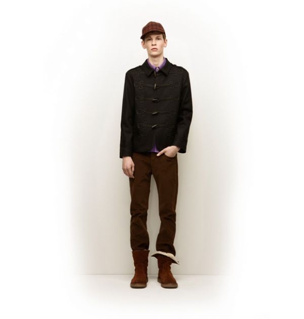
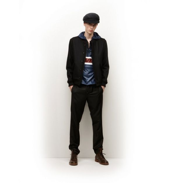
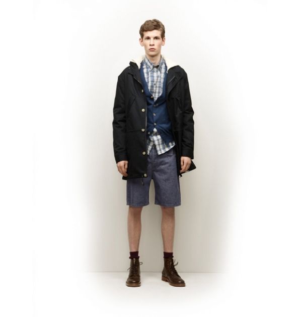
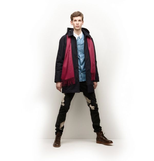
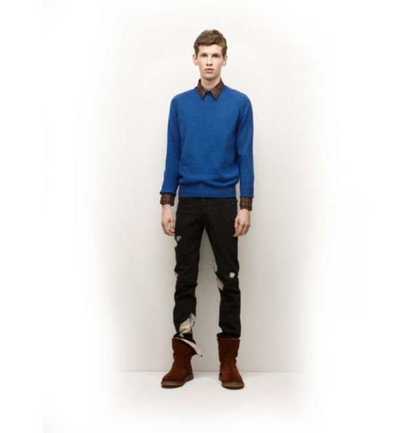
Let’s be real. The last couple seasons have been a slippery slope for A.P.C. In an attempt to capture a wide and diverse audience, committing to a concept appears to have become less of a priority. Drifting farther away from a distinct look or concept, this season’s collection has become an incoherent range of pieces that are fine by themselves, but problematic when grouped. Take for instance, the band jacket with the brilliant toggles. It’s a wonderful piece, but how does it relate to the jumpsuit–the bleached denim or a nautical anchor? What story is A.P.C. trying to tell here? It is difficult to buy into a label when there is no logical path to discern. The Autumn themed color palette brings the ensembles together, yet still, the pieces just do not click. There is something off. Perhaps, we can hope for a return to a direction similar to that of fall 2007–where a strong militaristic influence resulted in a cohesive collection of strong distinguishable pieces that were absolute must-haves. Here’s to subscribing to the notion of tough love in hope for what we know A.P.C. is capable of achieving.


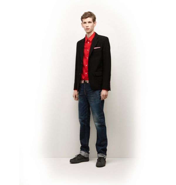
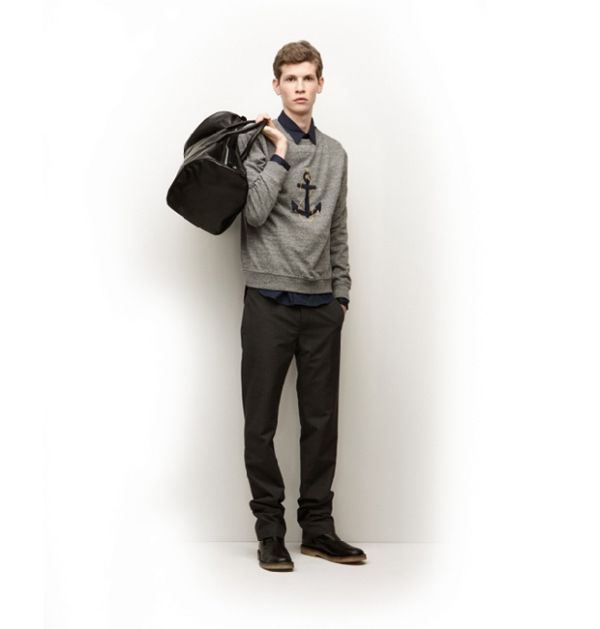
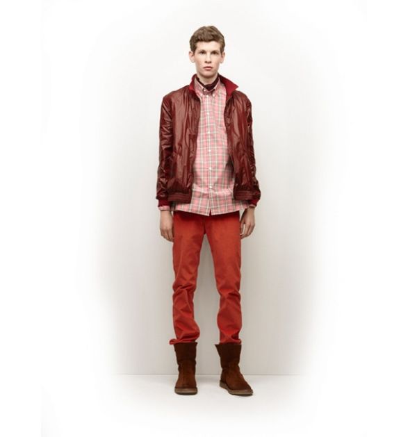
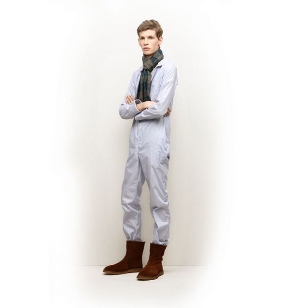
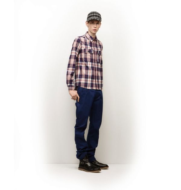
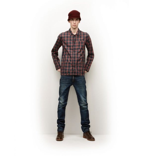
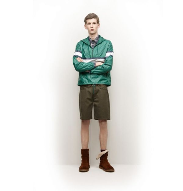
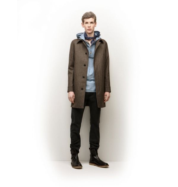




What I want to know is why the phrase “Fall 2010” is all over the website. How have they not noticed such an obvious mistake?
What I want to know is why the phrase “Fall 2010” is all over the website. How have they not noticed such an obvious mistake?
What I want to know is why the phrase “Fall 2010” is all over the website. How have they not noticed such an obvious mistake?
If those photos of the other model from the lookbook preview are any indication of what their Winter line will be like, things are looking up. There were some excellent pieces in that, and the overall look was much more coherent.
If those photos of the other model from the lookbook preview are any indication of what their Winter line will be like, things are looking up. There were some excellent pieces in that, and the overall look was much more coherent.
If those photos of the other model from the lookbook preview are any indication of what their Winter line will be like, things are looking up. There were some excellent pieces in that, and the overall look was much more coherent.
I really like this collection although I do agree about your comment on their past collections…sporadic/ non cohesive. I do enjoy their separates and think that they do a better job this collection of tying it all in. I made a post about it on my blog (link: http://iplayfaves.blogspot.com/2009/07/apc-industrial-revolution.html). I really enjoy your commentary on collections because I am a big fan of homme collections and men’s fashion. There really aren’t many blogs out there that do what you do as well as you do.
I really like this collection although I do agree about your comment on their past collections…sporadic/ non cohesive. I do enjoy their separates and think that they do a better job this collection of tying it all in. I made a post about it on my blog (link: http://iplayfaves.blogspot.com/2009/07/apc-industrial-revolution.html). I really enjoy your commentary on collections because I am a big fan of homme collections and men’s fashion. There really aren’t many blogs out there that do what you do as well as you do.
I really like this collection although I do agree about your comment on their past collections…sporadic/ non cohesive. I do enjoy their separates and think that they do a better job this collection of tying it all in. I made a post about it on my blog (link: http://iplayfaves.blogspot.com/2009/07/apc-industrial-revolution.html). I really enjoy your commentary on collections because I am a big fan of homme collections and men’s fashion. There really aren’t many blogs out there that do what you do as well as you do.
Thanks for the comment. It’s nice when people get it
I checked out your blog. I love this picture. http://static.pixelpipe.com/a161317e-4968-449f-b843-988af3796e36_m.jpg Cannot go wrong with tonal matching.
Thanks for the comment. It’s nice when people get it
I checked out your blog. I love this picture. http://static.pixelpipe.com/a161317e-4968-449f-b843-988af3796e36_m.jpg Cannot go wrong with tonal matching.
Thanks for the comment. It’s nice when people get it
I checked out your blog. I love this picture. http://static.pixelpipe.com/a161317e-4968-449f-b843-988af3796e36_m.jpg Cannot go wrong with tonal matching.
I don’t have enough of one color in my closet to do that. I think I will just stick with gradient nail color. It is much cheaper that way any and I can get a little crazy with it. Look forward to more posts. Thanks for checking my blog, hope you stop by again.
I don’t have enough of one color in my closet to do that. I think I will just stick with gradient nail color. It is much cheaper that way any and I can get a little crazy with it. Look forward to more posts. Thanks for checking my blog, hope you stop by again.
I don’t have enough of one color in my closet to do that. I think I will just stick with gradient nail color. It is much cheaper that way any and I can get a little crazy with it. Look forward to more posts. Thanks for checking my blog, hope you stop by again.