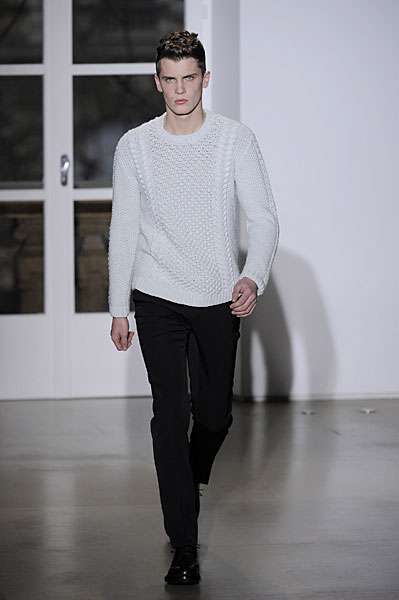
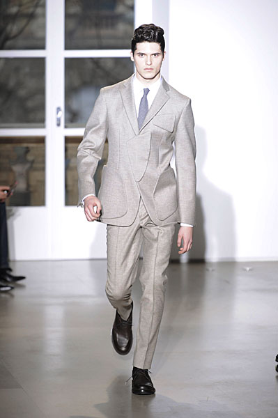
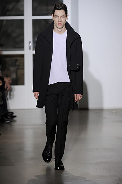
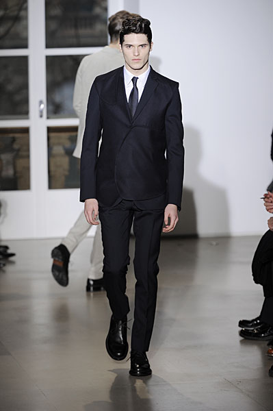
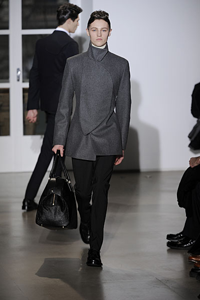
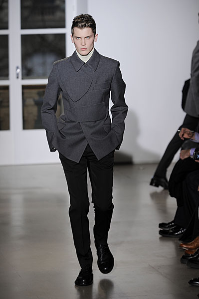
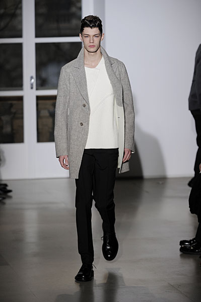
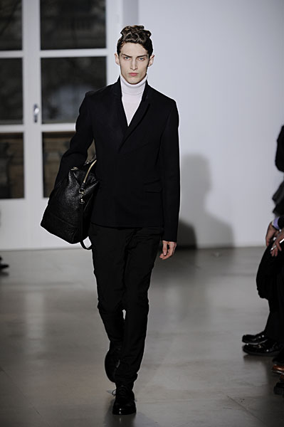
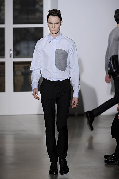
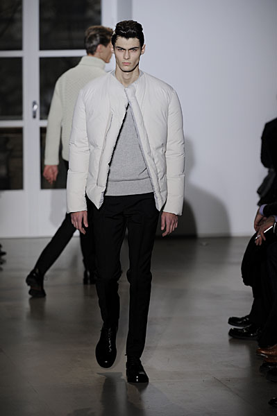
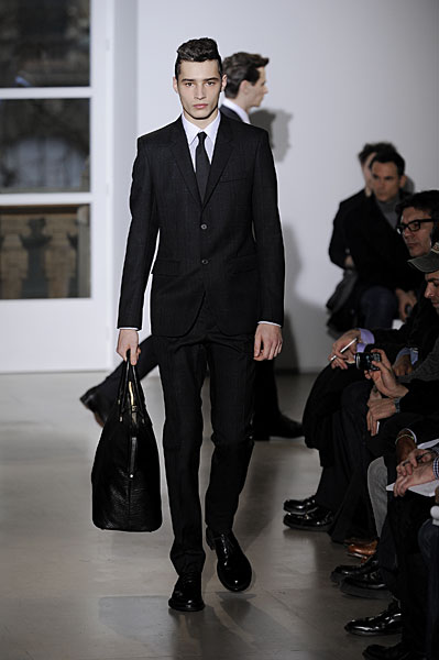
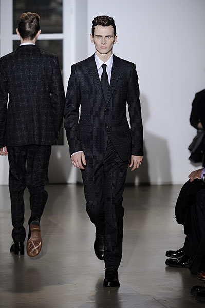
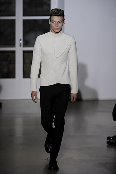
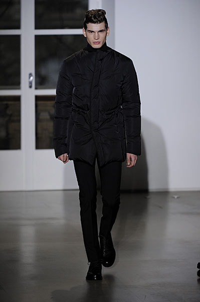
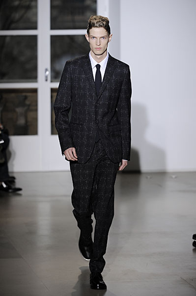
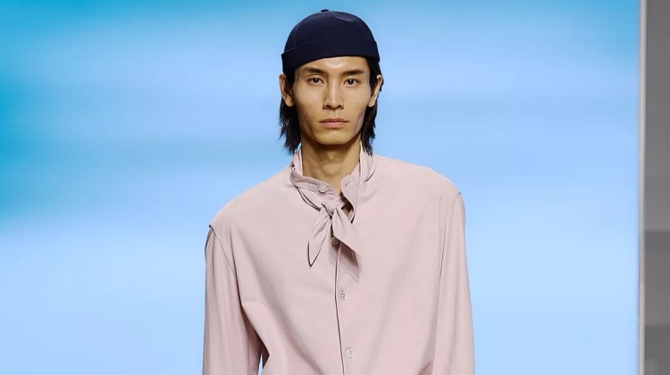
Designer Raf Simons continues to test the boundaries of minimalism with his latest collection for Jil Sander. When not gracing the silhouette with soft tailoring, Simons aggressively cuts and pulls at the material with darts and sharp hems. With a stationary color palette of blacks and clays, Simons focuses the attention on the details, which has very much become the image of Jil Sander.
              |



Boring…
Boring…
most probably a great making & quality but definitely not the most exciting …
most probably a great making & quality but definitely not the most exciting …
Sooo Raf Simons! Love it!
Sooo Raf Simons! Love it!
jil sander/raf never disappoints… me!! i love simplicity/luxury.
jil sander/raf never disappoints… me!! i love simplicity/luxury.
kinda boring and unwearable at times, and whats on the top of the models heads? a squirrel?
kinda boring and unwearable at times, and whats on the top of the models heads? a squirrel?
love the continuity from last fall… and the subtle inspiration derived from Comme des Garcons… Raf de-constructed
love the continuity from last fall… and the subtle inspiration derived from Comme des Garcons… Raf de-constructed
Everything is beautifully cut and the overlapping details are interesting and subtle, but this is certainly not as much of a show-stopper as Simons' last shows of Jil Sander. Still, though, the proportions are so pleasing that it doesn't really matter. And I agree–who the hell did the hair? That really distracted.
Everything is beautifully cut and the overlapping details are interesting and subtle, but this is certainly not as much of a show-stopper as Simons' last shows of Jil Sander. Still, though, the proportions are so pleasing that it doesn't really matter. And I agree–who the hell did the hair? That really distracted.
raf kicks so much ass!
raf kicks so much ass!