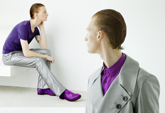
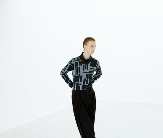
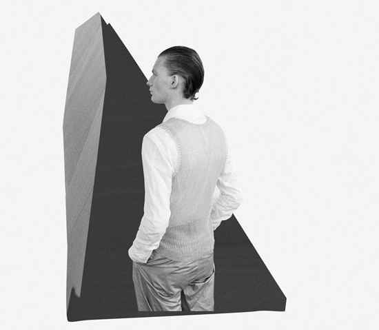
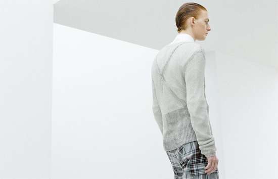
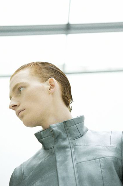
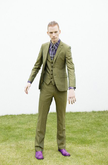
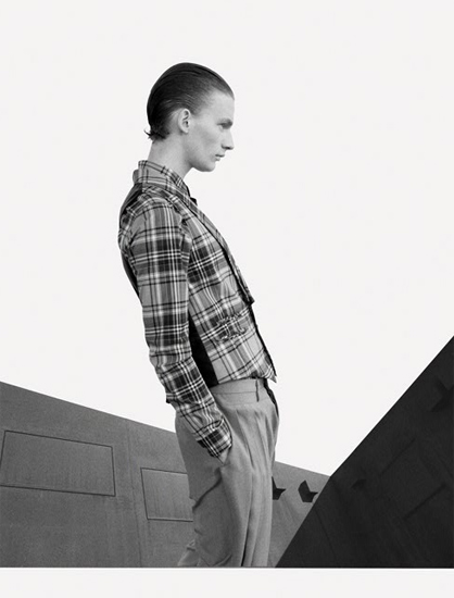
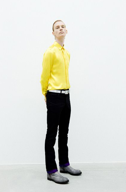
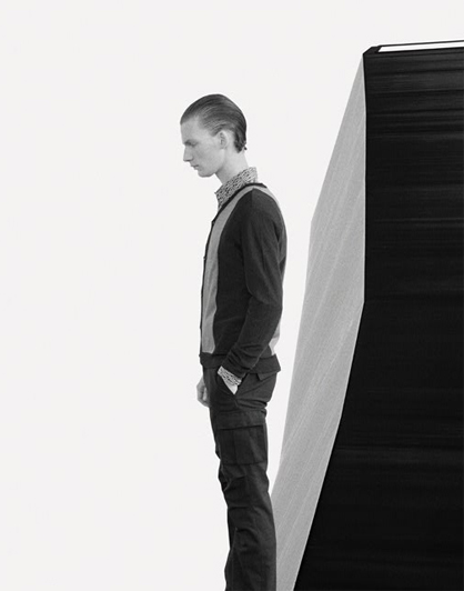
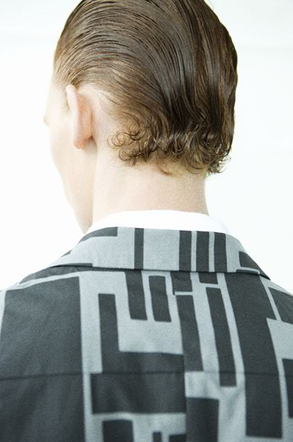
Titled “Geometrical”, one would assume that the latest collection from popular Japanese label Man of Moods would embrace shapes of all sizes and colors, but that is not the case. Last season’s “Morans” collection was all about bright colors and “M” emblems. This season, however, takes a step back with a color palette that is generally subdued. Clean space is created by basing the collection on grounding colors black and gray. Establishing a slim silhouette and fine tuning the finer details like button placement, color is slowly brought in subtly with the predominant use of purple. When not playing with color, spontaneity is introduced to the collection in the form of sheer and metallic elements. The current season is spring, but this collection offers an excellent example of how to utilize color for the upcoming gloomy fall season.



there is something i really like about this that i can’t really point out…
there is something i really like about this that i can’t really point out…
there is something i really like about this that i can’t really point out…
the clothes and geometric shapes as background made this a “fashionisto” 🙂
the clothes and geometric shapes as background made this a “fashionisto” 🙂
the clothes and geometric shapes as background made this a “fashionisto” 🙂
love the color contrast
love the color contrast
love the color contrast
Product looks great
Product looks great
Product looks great