
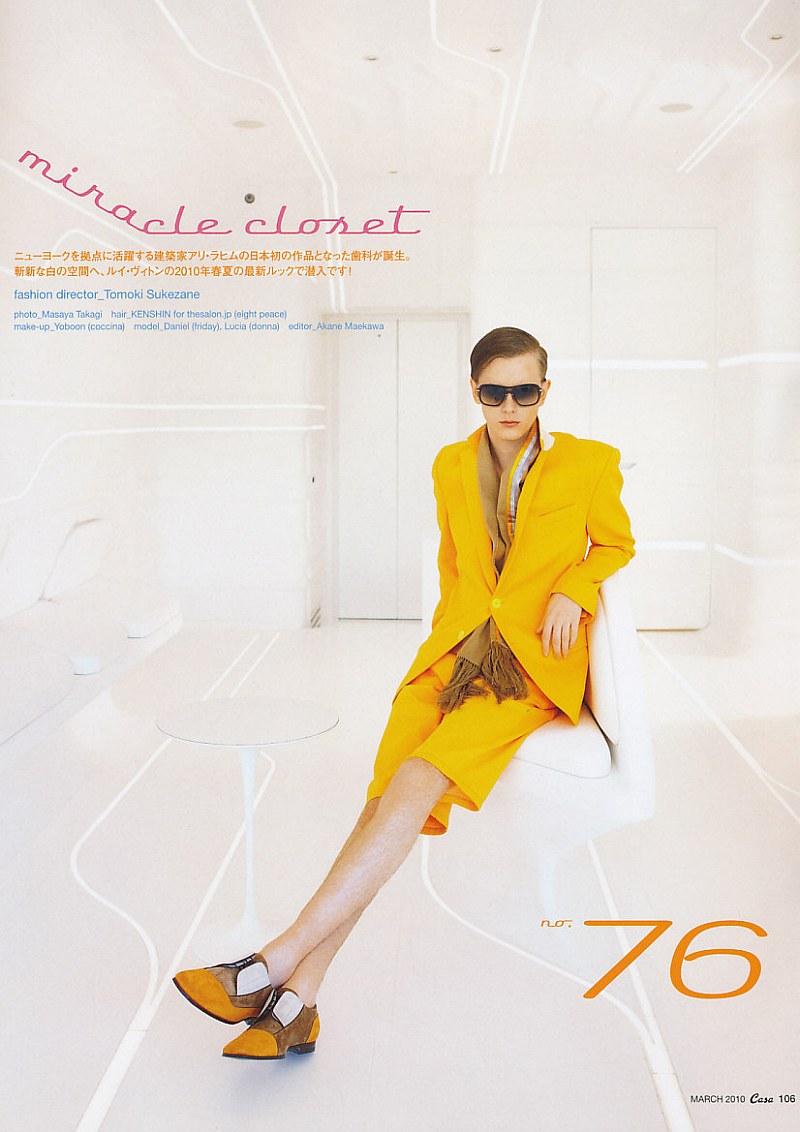
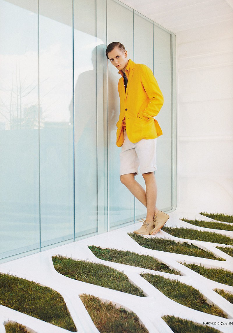
In a sea of safe colors, photographer Masaya Takagi captures one of the season’s brightest indulgences. Styled by Tomoki Sukezane, the March 2010 issue of Japanese magazine Brutus crafts a clean white space for Daniel Hicks to shine in an upbeat yellow number from Louis Vuitton’s messenger inspired spring collection.

This bright yellow is fantastic! I read somewhere it was inspired by the colour of most NYC cabs. The photographs aren't bad either. They are in this slightly high key style which is spreading absolutely everywhere at the moment. The easy option may have been to contrast the bright yellow with other colours. It is less easy to work with colour against white, but in this case, it really does work!
<a href="http://davidikus.blogspot.com” target=”_blank”>http://davidikus.blogspot.com
This bright yellow is fantastic! I read somewhere it was inspired by the colour of most NYC cabs. The photographs aren't bad either. They are in this slightly high key style which is spreading absolutely everywhere at the moment. The easy option may have been to contrast the bright yellow with other colours. It is less easy to work with colour against white, but in this case, it really does work!
” target=”_blank”>http://davidikus.blogspot.com
Love the apricot! One of my favorite colors for summer!
Love the apricot! One of my favorite colors for summer!
Love the apricot! One of my favorite colors for summer!
Love the apricot! One of my favorite colors for summer!