As many of you probably already know, Steven Alan is collaborating with Urban Outfitters, producing the brand Lark & Wolff. Urban Outfitters has added a couple pieces to their online inventory. These pieces can be viewed at their site. To be quite honest, I don’t know if it is the pictures or the stylist, but the pieces look sloppy and not what I’d expect from Alan. I guess I’ll have to see them in person.
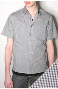
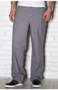


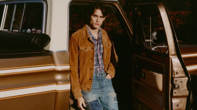

Perhaps it looks sloppy because of the way these designs are styled (or not styled in this case). I just googled Lark & Wolfff and saw a closer detail of what the shirts look like, and from what I saw I don’t find anything in particular that’s bad…or good. The quality of it seems exceptional though.
Perhaps it looks sloppy because of the way these designs are styled (or not styled in this case). I just googled Lark & Wolfff and saw a closer detail of what the shirts look like, and from what I saw I don’t find anything in particular that’s bad…or good. The quality of it seems exceptional though.
Perhaps it looks sloppy because of the way these designs are styled (or not styled in this case). I just googled Lark & Wolfff and saw a closer detail of what the shirts look like, and from what I saw I don’t find anything in particular that’s bad…or good. The quality of it seems exceptional though.
I think my problem is with their presentation. They way the pieces are presented, it looks just like any other brand…nothing special.
It reminds me of Old Navy.
Ouch.
Interestingly, Old Navy has been at work trying to transform themselves into a quality brand. If you do a quick google search, you’ll see their female lines are improving, but their male lines in my opinion still are not worth a look, mention, breath, etc. etc.
Instead of working on Old Navy, I feel it would be better to work on the sister store Gap. They need to take a cue from H&M and present affordable trend driven clothes that are in demand.
It really looks typical and the pieces do not seem to have a modern edge to them… something we’ve seen so many times already.
It really looks typical and the pieces do not seem to have a modern edge to them… something we’ve seen so many times already.
It really looks typical and the pieces do not seem to have a modern edge to them… something we’ve seen so many times already.
Exactly. It just looks sloppy.