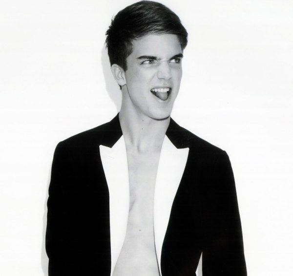
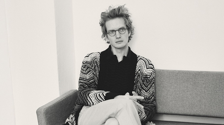
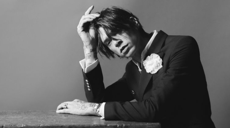
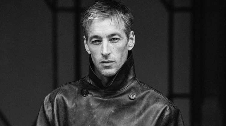
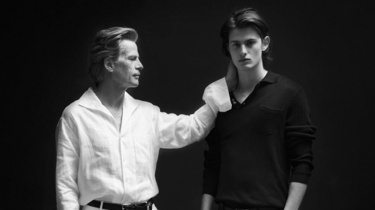
Playing at both naughty and nice in his recent editorial for Seventh Man, Major’s River Viiperi is no doubt a young model of many personalities. Photographed by Ben Lamberty and styled by Dean Hau, we are treated to both moments of great intimacy and playfulness.



I liked the second photo, yes he's HOT
I liked the second photo, yes he's HOT
I liked the second photo, yes he's HOT
I liked the second photo, yes he's HOT
Adorable. More naughty than nice I think 😉
http://www.chungkitblog.wordpress.com
Adorable. More naughty than nice I think 😉
http://www.chungkitblog.wordpress.com
Adorable. More naughty than nice I think 😉
http://www.chungkitblog.wordpress.com
Adorable. More naughty than nice I think 😉
http://www.chungkitblog.wordpress.com
the best from Viiperi yet.
the best from Viiperi yet.
the best from Viiperi yet.
the best from Viiperi yet.
agreed. what a shame. BIG sad face :(!
agreed. what a shame. BIG sad face :(!
agreed. what a shame. BIG sad face :(!
agreed. what a shame. BIG sad face :(!
I never tire of looking at River.
I never tire of looking at River.
I never tire of looking at River.
I never tire of looking at River.
Which bulge? (I am sure it's all down to the design of the underwear).
Which bulge? (I am sure it's all down to the design of the underwear).
Which bulge? (I am sure it's all down to the design of the underwear).
Which bulge? (I am sure it's all down to the design of the underwear).
Great pictures, I love the sexual connotations
Jimmy http://www.delastyle.blogspot.com
Great pictures, I love the sexual connotations
Jimmy http://www.delastyle.blogspot.com
Great pictures, I love the sexual connotations
Jimmy http://www.delastyle.blogspot.com
Great pictures, I love the sexual connotations
Jimmy http://www.delastyle.blogspot.com
the bulge looks kinda small haha 🙂
the bulge looks kinda small haha 🙂
the bulge looks kinda small haha 🙂
the bulge looks kinda small haha 🙂
Yall a weirdos. Why does the size of his junk matter to you? 🙁 sad face
Yall a weirdos. Why does the size of his junk matter to you? 🙁 sad face
Yall a weirdos. Why does the size of his junk matter to you? 🙁 sad face
Yall a weirdos. Why does the size of his junk matter to you? 🙁 sad face
He should have gotten that issue of L'Officiel Hommes.
He should have gotten that issue of L'Officiel Hommes.
He should have gotten that issue of L'Officiel Hommes.
He should have gotten that issue of L'Officiel Hommes.
i want to marry him!
i want to marry him!
i want to marry him!
i want to marry him!
Tongue sticking out is not too flattering.
Photo #3 is the best one here. Nice use of shadowing.
It gives it that mysterious look.
Tongue sticking out is not too flattering.
Photo #3 is the best one here. Nice use of shadowing.
It gives it that mysterious look.
Tongue sticking out is not too flattering.
Photo #3 is the best one here. Nice use of shadowing.
It gives it that mysterious look.
Tongue sticking out is not too flattering.
Photo #3 is the best one here. Nice use of shadowing.
It gives it that mysterious look.